
What's the effect of the dominance of private health insurance industry on the personal healthcare expenditures in the U.S,.?
A data-viz by Yuxiang Cheng
Why does it matter, then?
“NHE (national health expenditure) grew 2.7% to $4.3 trillion in 2021, or $12,914 per person, and accounted for 18.3% of Gross Domestic Product (GDP).”
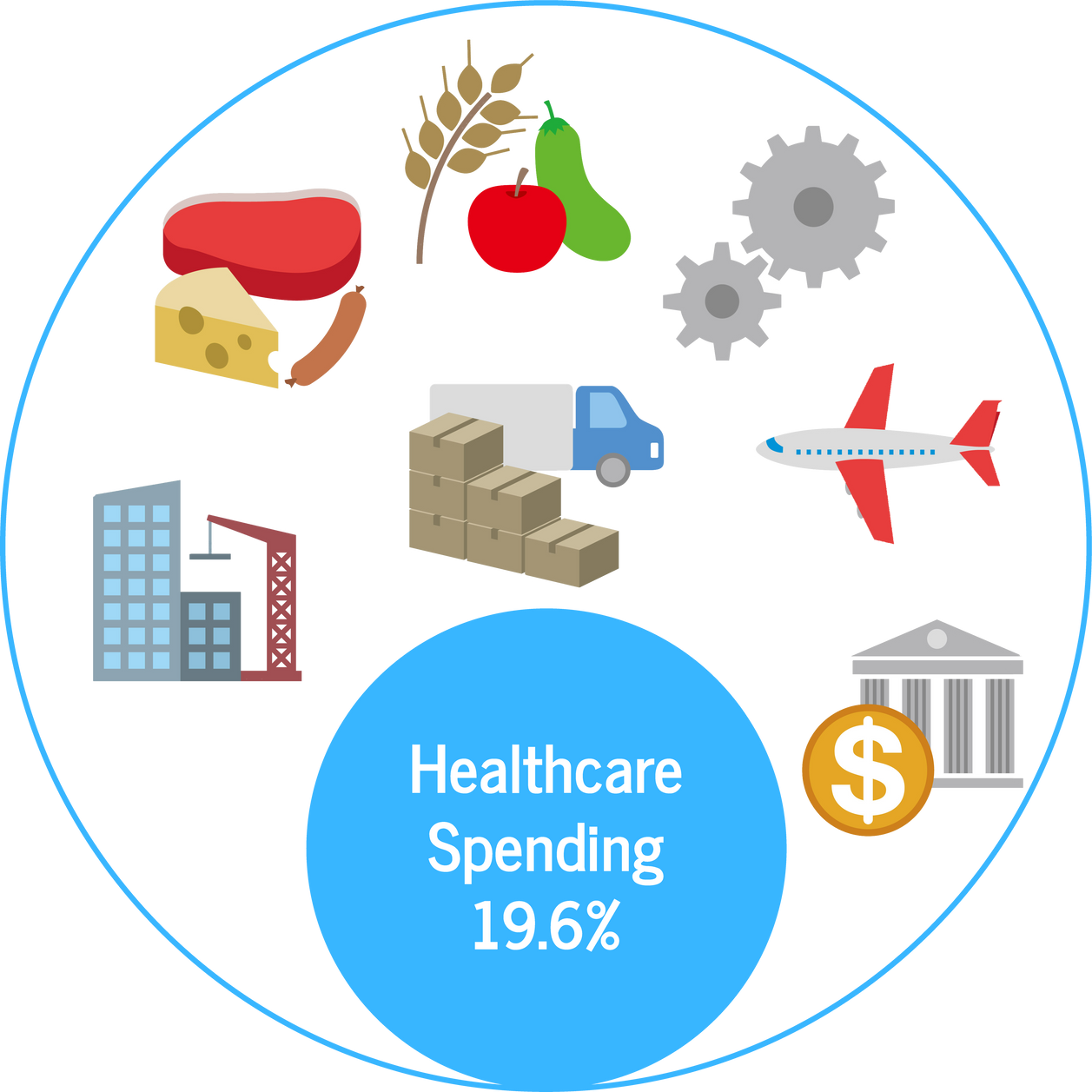
“Over 2022-2031 average growth in NHE (5.4 percent) is projected to outpace that of average GDP growth (4.6 percent) resulting in an increase in the health spending share of GDP from 18.3 percent in 2021 to 19.6 percent in 2031.”
-----U.S. Centers for Medicare & Medicaid Services
Estimated NHE Share
in U.S. GDP in 2031
When the growth of NHE outpacing that of the GDP, its effect will be pronounced to individuals as the portion of healthcare spending would rise
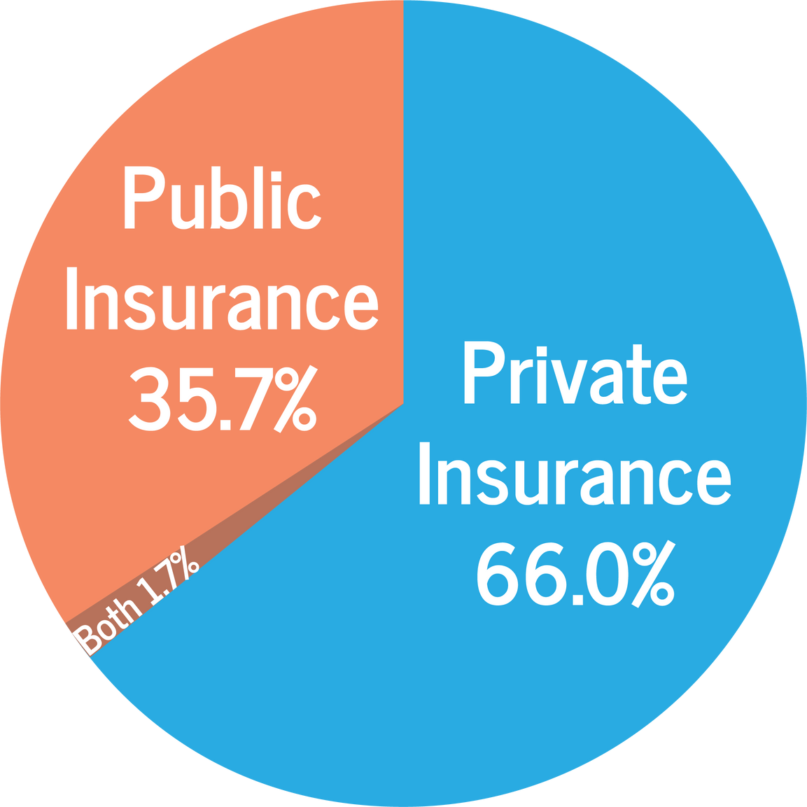
“In 2021, private health insurance coverage continued to be more prevalent than public coverage, at 66.0 percent and 35.7 percent, respectively.”
-----U.S. Census Bureau
What is it like in other parts of the world?
Public Health Insurance Coverage across OECD countries from 2016 to 2020
(% of the total population)
The bar chart offers us two most noticeable informations: the first is that most of the OECD countries aims to have a universal public health system of some kind since most of the OECD countries have 100% public health insurance coverage. The second is that USA is an outliner with vast majority of its population not covered by public healthcare system.
How is the public health coverage connected to the personal health spending?
Public Health Insurance Coverage (% of the total population) versus Household Out-of-Pocket Payments (per capita, current prices, current PPPs) across OECD countries from 2015 to 2022
From this graph, there are two noticeable patterns among the OECD countries (except for the outliner). The first pattern appears to belong to the developed world (in Western Europe and Asia) having mostly 100% of public health coverage but the out-of-pocket payment is quite high. The second pattern appears to belong to the developing regions (in Eastern Europe and South America), with less stable public health coverage that still mostly (vastly) above 60% but the out-of-pocket payment is lower.
Back to our outliner, why is it like this?
National Health Expenditures of U.S., Out of Pocket from 1960 to 2021 (comparing to the curve of Inflation Rate)
The out-of-pocket NHE of the U.S. have been growing in mostly exponential rate from, which, as shown in the first line chart is mostly independent from the inflation rate.
National Health Expenditures on Private Health Insurance of the U.S. from 1960 to 2021 (comparing to the curve of Out-of-Pocket NHE)
At the level of personal everyday spendings, the out-of-pocket payment for healthcare should be negatively correlated to the spending on insurance. What’s shown in the second line chart shown is that the growth of the NHE on Private health insurance is even faster, even more exponential than the curve of out-of-pocket NHE. It’s more so in the 21th century since the growth rate increased drastically.
Conclusion, and what’s more
The formation of all healthcare systems depends on complex social-economic structures. There’s no simple answer to it. The sets of data presented outline the issue and its dimensions.
- The dominance of private health insurance in a society is a rare phenomenon.
- Many countries aims to achieve a high coverage of public health insurance, but the out-of-pocket expenditures varies depending on the cost of medical resources and purchasing power in specific countries.
- The U.S. national expenditures on private health insurance grows faster than the out-of-pocket National Health Expenditures.
Other than the comparison between private and public insurance, it’s also necessary to further investigate the interconnections of the hospital, insurance, and pharmacy.
Sources:
OECD Health Statistics: Social Protection, OECD iLibrary
OECD Health Statistics: Health Expenditure Indicators, OECD iLibrary
Health Insurance Coverage in the United States: 2021, United States Census Bureau
World Health Statistics 2023, WHO
Universal Health coverage Data, The World Bank
Countries with Universal Healthcare 2023, Wisevoter